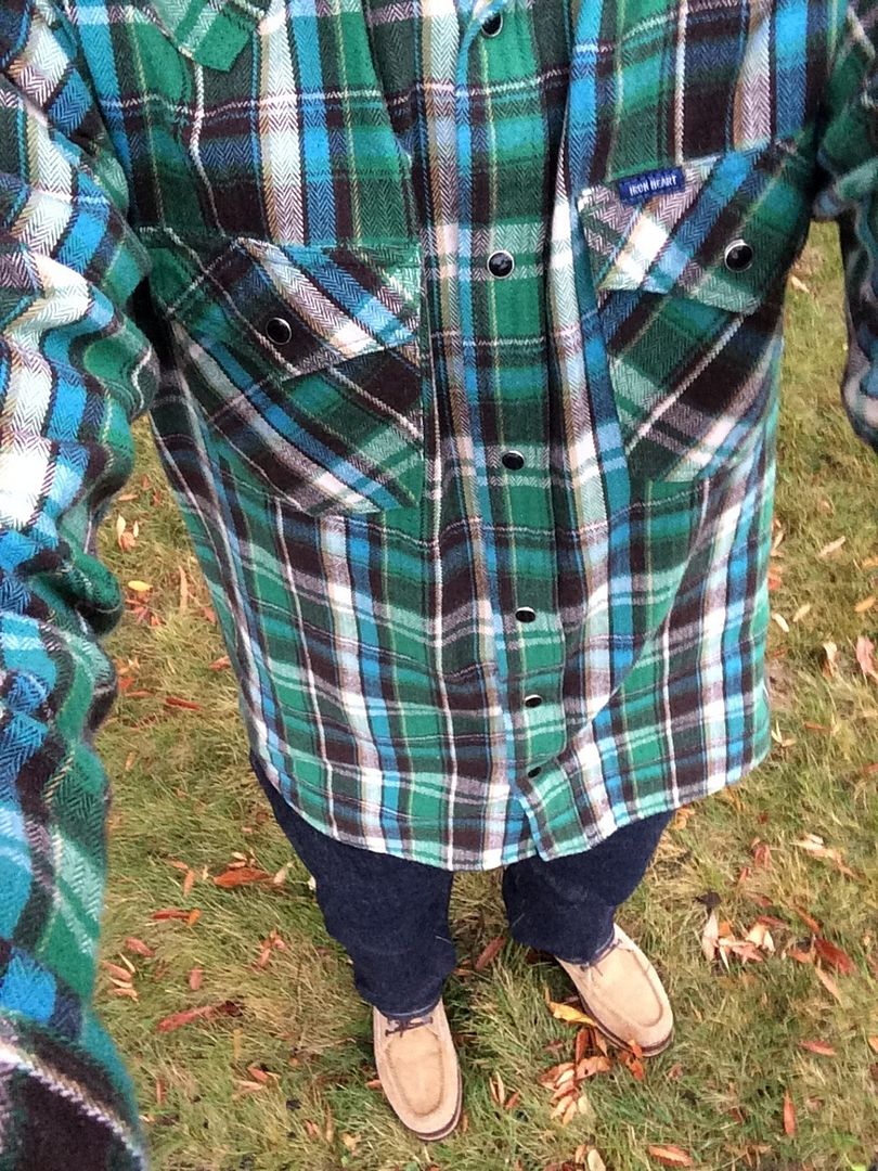
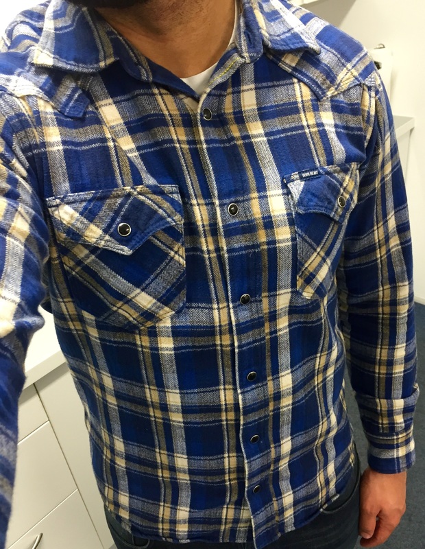
IHSH-86 - 2013 Heavy Herringbone Flannels
-
Finally, I have the 86 set.

-
-
Wow, almost a year since the last post. Still one of my favorite IH items, even if I find the green more attractive when it's worn by someone else but me.
-
Lovely @den1mhead - great to see some 86 love but hard to believe it dates back to 2013, how time flies!
-
@Madame Buttonfly, I love my IHSH-86
 and acquired it at the start of 2015 from a guy who can't have worn it as it's absolutely mint for 2 years old.
 -
-
eek, as a relative newbie to IH it's troublesome when these old product threads get dragged up, now I want the blue one.
-
eek, as a relative newbie to IH it's troublesome when these old product threads get dragged up, now I want the blue one.
No kidding! It's dangerous to go down the rabbit hole that is extinct Iron Heart products!
-
Totally agree. I love this shirt in both colors. This was my first IH shirt purchase (blue colorway) but unfortunately I ordered a size too small and by the time I returned it there were no more left in my size.
-
Does anyone have either color in Large?
-
I have a green in large that's a bit too small in the shoulders for me….would love to trade it for an XL or for other shirts in XL or L depending on measurements before selling it though
-
@DanielAFC peep your message inbox.
-
My oh my what a beautiful shirt. Anyone with an XL in blue you're thinking of selling? PM me!
-
That blue @Finn666 …jealous is the best word to describe!
-
This may be an odd question, but is there anything I can do to make the colors pop more? I just received the 86 in both Green and Blue, and they seem to be slightly more faded than I see them being in the pics. Might have been washed a bit too hard.

-
I actually prefer the washed out / muted look. I think you'll have to learn to embrace it, the colour won't come back.
-
I believe that the majority of places increase saturation/vibrance on photos which makes colors "pop" more. It's something you have to understand today with almost every shop/webshop having access to dslr and good post-processing software. I always assume that every photo of a shirt/shoe has had some editing done and more times than not its to increase said "pop".


 … excellent!