Watches - another OCD problem
-
Watches are something I haven't dedicated many of my dollars to. But you guys are killing me with all these incredible pieces. Probably best I stay away from this thread.
-
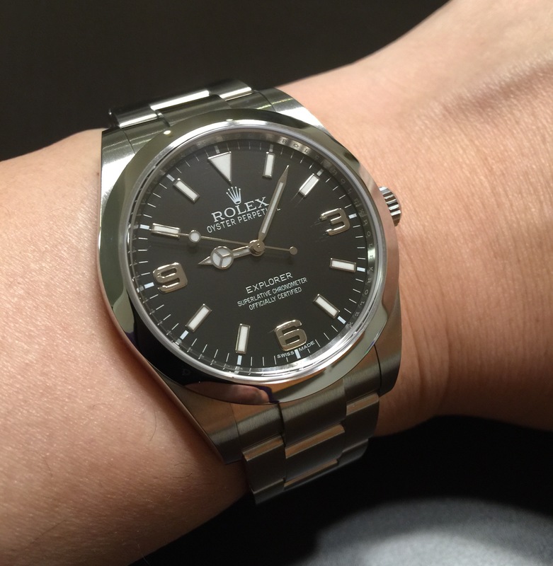
Nice one ijpx. I have owned a MM300 and own an Explorer (36mm) and both are excellent for different reasons. However, both are excellently made and are bombproof. Nice buy on the Rolex but don't let the Seiko get dusty!
Sent from my iPhone using Tapatalk
-
Date windows are one of those things that seem to be really hard to get right. I prefer watches that don't have them these days.
I'm starting to feel the same way, especially since it seems like so many manufacturers insist on putting the date window at 4:30, which I despise.
-
I prefer 12 or 6. Just seems to make for a more cleanly balanced dial to me.
-

I know the layout on my Type III isn't for everyone but it sure makes for great legibility. Case in point, 6 & 12 o clock dates work well.
Sent from my iPhone using Tapatalk
-
Generally speaking, the small seconds isn't one of my preferred complications, but that one is really nice. And I agree- very legible.
EDIT: The more I look at it the more I like it. This may be my new favorite Sinn.
-
nice watch, @Anesthetist .I like it's simplicity
-
And @ijpx's Rolex hasn't got a date window on it to distract.

Nice Explorer. I'm with @Anesthetist when it comes to watches of that size.
-
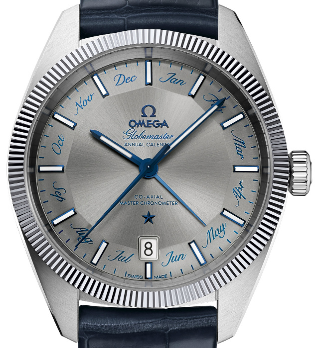
Speaking of date windows, Omega have just announced an annual calendar version of the Globemaster.

I'm in two minds about the months around the dial. It looks wrong, but I found the standard Globemaster to be a bit sterile. The typeface has a slightly whimsical sixties vibe, which gives the piece a bit of character.
-
Black Bezel Tudor Black Bay Heritage finally arrived today! Must say that I am very pleased with it…


Sent from my iPhone using Tapatalk
-
Very nice, Neil - these are a lot of watch for the money, imo. Tempted by some of the second hand prices I've seen for the blue and red bezel versions…
-

I'm in two minds about the months around the dial. It looks wrong, but I found the standard Globemaster to be a bit sterile. The typeface has a slightly whimsical sixties vibe, which gives the piece a bit of character.
I applaud Omega for trying something new; I've definitely never seen that before. As you say, it has a slightly whimsical sixties vibe, and I think the bezel fits nicely with that feel.
Don't think I'd want to wear it, though.


